

PROJECT
Building an Agile Project Dashboard
Dawid Jasinski, PhD · 24 min read
It is well known that a project manager without a solid toolbox is like a soldier without a rifle - seemingly the same thing, but on the battlefield, he won't do the job.
Jira, Jiri, Miri, Siri
Scrum, Ban, Kanban
It is well known that a project manager without a solid toolbox is like a soldier without a rifle - seemingly the same thing, but on the battlefield, he won't do the job. So, my dear, if you want to manage projects in an agile way, first of all:
- Do solid research of tools on the market for agile project management. Don't even think about Post-It notes and markers. They are passe, and they click poorly.
- Choose the best solution (hint: the more expensive, the better)
- Research companies that can implement the tool in your company
- Choose a company that will implement the tool and train staff (hint: the more expensive, the better)
Now you can start to manage projects in an agile way using 5-10% of the tool's functionality and preferably in the wrong way. Or don't use it at all. The important thing is that you have it.
But, god damn it, manage agilely!
Agile... means how?
Well, so that the world doesn't have to wait for you to prepare, plan and report the fruits of your hard work in a PowerPoint that will make the nations kneel!
And, contrary to Monday.com's opinion, you don't need a combine for everything. Think back to your road trips 20 years ago. The preparation and itinerary consisted of a map with a destination point, which determined travel direction. The map was not updated continuously and did not predict traffic jams or roadworks. It was known that there would probably be a diversion somewhere anyway, so there was no point in planning which road to take and where to stop for lunch. The most important thing was to go from the house to the left, not to the right, and to enter the motorway in the right direction.
That's the map I'm going to give you today, so that you can always, without unnecessary preparation, start driving when you want to, not when NASA engineers check all the safety systems with a checklist and astronomers from the Royal Observatory Edinburgh give the green light for the launch.
So let's get on with it!
Here and at the beginning of this article, you will find a link to the spreadsheet. The file consists of seven tabs (two are hidden; they are only needed for the tools to work correctly). It also contains several macros. You must, therefore, permit to use of the macros. All macros and tabs are unlocked. You can view them at any time, trace the macros and modify them as you wish. So don't worry. The file contains the data of an example project to demonstrate its full functionality to you.
I will now discuss each tab in turn.
Dashboard Tab

This tab contains a summary of the project status. You can find out from it at a glance whether you are still far from your destination, what time you will arrive and whether any safety lights are burning on the dashboard.
1. The cumulative flow diagram shows the amount of work completed, work in progress and work not started up to the present moment. We can see when the project started and the completion date of the current iteration (CW stands for calendar week) on the horizontal axis. The vertical axis shows the amount of work presented in points (more on points later).
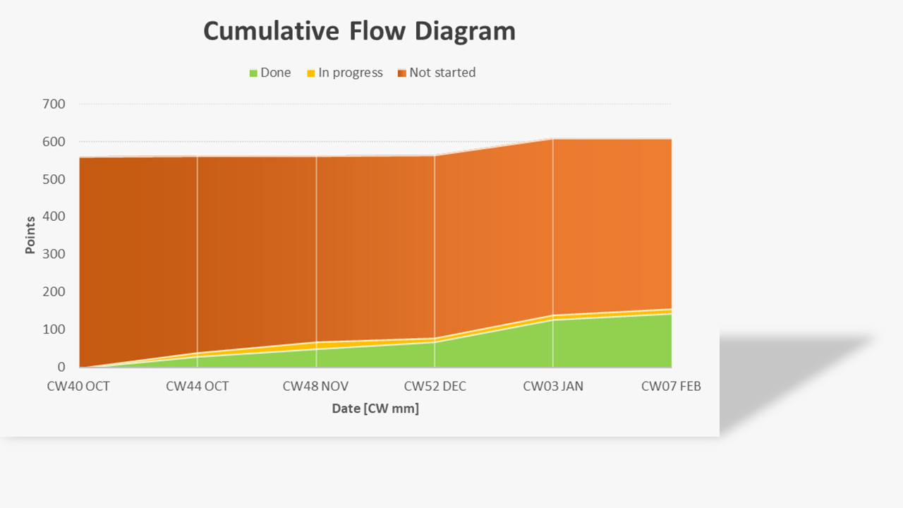
The Cumulative Flow Diagram shows clearly the relationship between work done, in progress and not started. It also shows the changes in the amount of work to be done. It can be seen that the total amount of work increased between December and January. This may have been due to underestimating the amount of work at the start of the project or an increase in project work scope! It is worth bearing this in mind when discussing the project delay with the client.
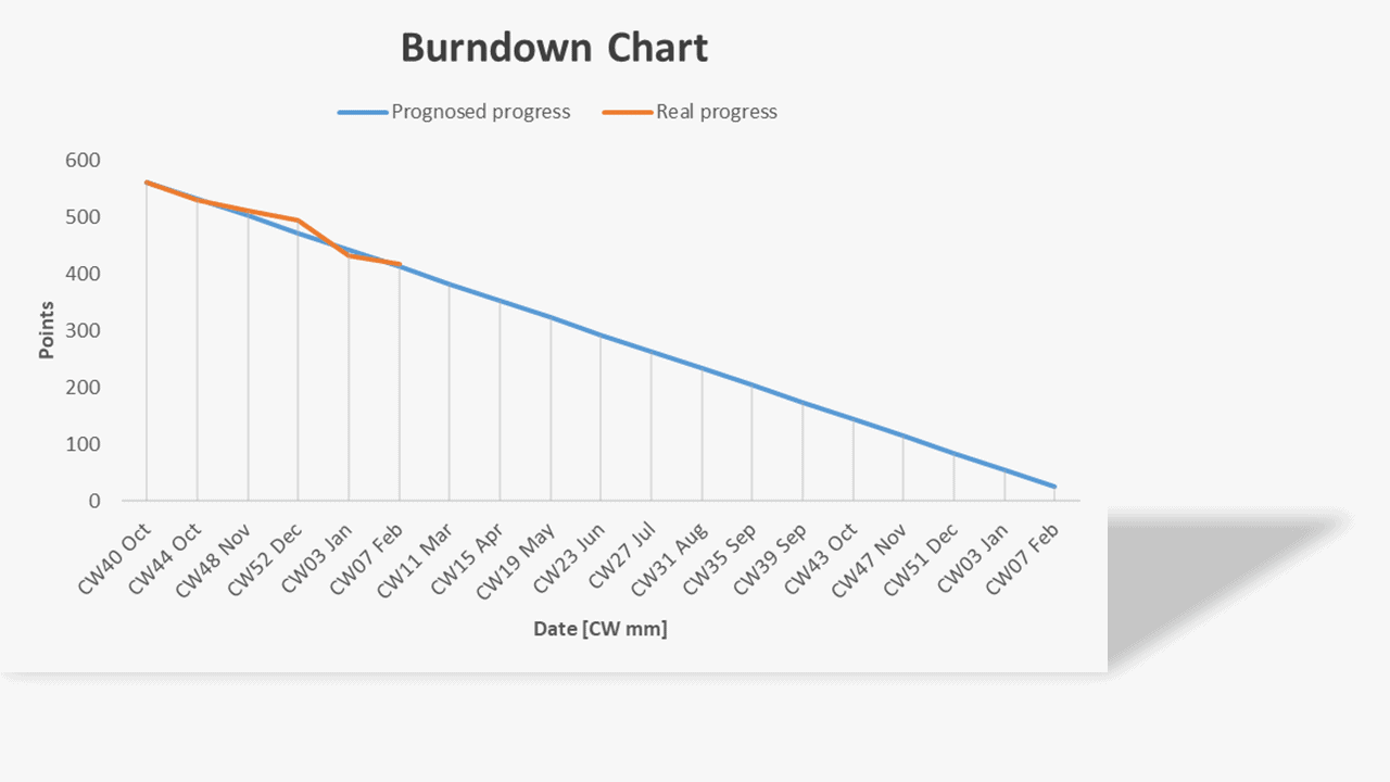
2. The Burndown Chart shows the progress of the work. This chart shows the project's expected completion date - assuming a constant average rate of project work. The blue line represents the ideal progress. The orange line shows the actual progress. It can be seen on the graph that the pace of work is not equal. However, this is normal - especially at the beginning of a project. By monitoring the average rate of progress, it is possible to estimate the end date with greater accuracy and observe dips in the work rate. These are often caused by underestimating the amount of work or an increase in the scope of work. The latter can be easily recognised by looking at the cumulative flow diagram.
3. Iteration velocity shows the pace of work of the team in particular iterations. The speed of work usually normalises in the first 3-5 iterations and then remains constant. This allows us to estimate the project completion date better. It is worth looking at the iterations in which the pace of work deviates significantly from the average. In this case, iteration #4 deserves attention. Something strange has happened here. The high acceleration may result from the completion of outstanding work from previous iterations (points are awarded during the interaction only to tasks that have been completed). We will be able to check this by analysing the data in the Backlog tab. The orange line is the trend line. It is important that it is as horizontal as possible.
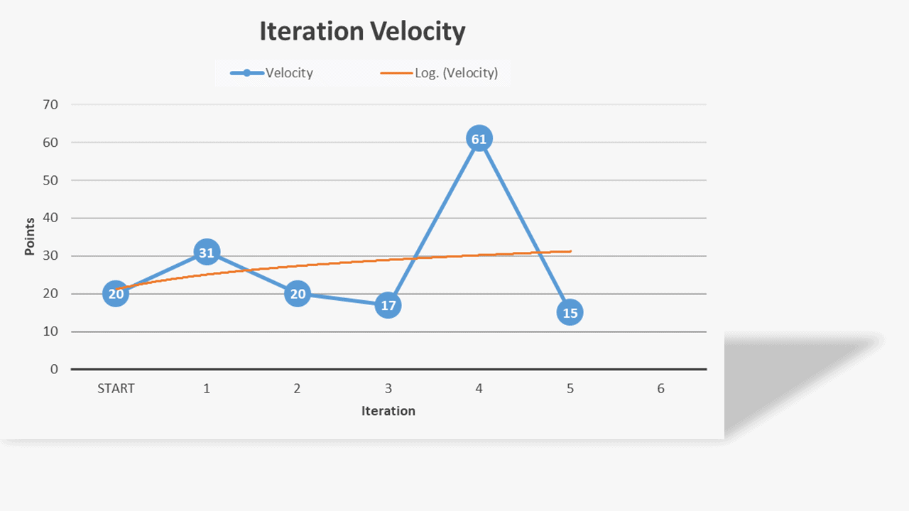
The speed of project work fluctuates naturally, and it is not worth analysing every deviation from the average in search of its reasons. If this fact were not taken into account, erroneous conclusions could be drawn from this graph. Let us take a closer look at the above chart. We start the project with an assumed speed of 20 points. This is just an educated guess, as the team has not yet worked together, and the work scope is largely incomparable to previous projects. After the first iteration, the project manager praises the team for their super efficiency. After the second iteration, however, the pace slows down considerably. This is a regular occurrence. The project manager disciplines the team because of the slowdown. In the next iteration, the speed drops even more. The project manager escalates the problem of laziness in the team to his superiors. In the next iteration, the pace picks up. The disciplinary hearings have had the desired effect! With a sense of a job well done and convinced of its effectiveness, management returns to routine. In the next iteration, the pace drops dramatically again. Apparently, the team has become lazy again, and the carrot and stick method needs to be applied.
However, if one were to take the average speed of the work at the level of 20 points (omitting the first educated guess and the out layer in iteration four if we know what it results from), one could say that the team works at a predictable, constant speed and save themselves the work and the team the emotional roller coaster.
4. The risk burndown graph provides a summary qualitative assessment of risk. On the horizontal axis, we see the level of risk in each iteration. The vertical axis represents, in turn, the summary value of risk severity. Risk severity is the product of the probability of a risk occurring and its impact on the project (details later). Each colour on the graph represents one risk. It can, therefore, be seen that 15 risks have been identified in the project. You can also see that some risks were identified in the second iteration. Some new risks have also arrived in the third iteration. The width of the individual bars increases, decreases, or sometimes remains constant for several iterations.
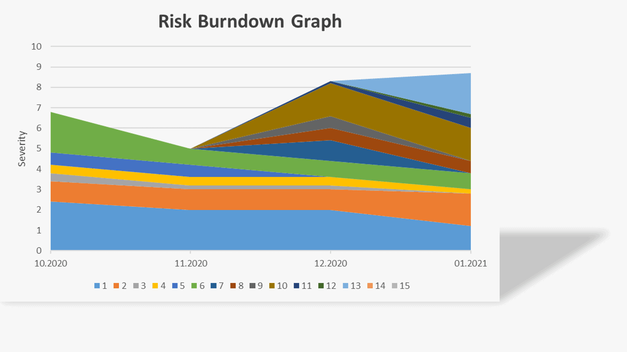
What is important here is that the total amount of risk decreases over time.
Why?
In an agile approach to project management, high-risk, high-value tasks should be completed as quickly as possible to protect against project failure due to risks materialising late in the project. For example, if we discover a risk that a seat will not fit in the car door at the beginning of a project, it is reasonable to make a mockup as soon as possible and check whether it will fit in the car. If this is not done and the seat is too big, all the other design work will waste time and money.
For the total of risks to decrease, these risks must first be identified. Otherwise, they cannot be managed. In this example, it can be seen that the risk analysis was not carried out thoroughly enough at the start of the project, and many risks were added in subsequent iterations. Simultaneously, the most significant risks identified at the beginning of the project were not quickly reduced or eliminated.
5. The last chart shows a map of all risks. A black point represents each risk. On the horizontal axis, we have the impact of the risk on the project. On the vertical axis, the probability of the risk occurring. The whole map is divided into nine areas. Risks with a low probability of occurrence and a low impact on the project can be ignored. Risks with a high impact on the project and a moderate probability of occurrence and risks with a high probability of occurrence and a moderate impact on the project should be considered individually. Risks with a high probability of occurrence and high impact on the project should be downgraded, eliminated or transferred.
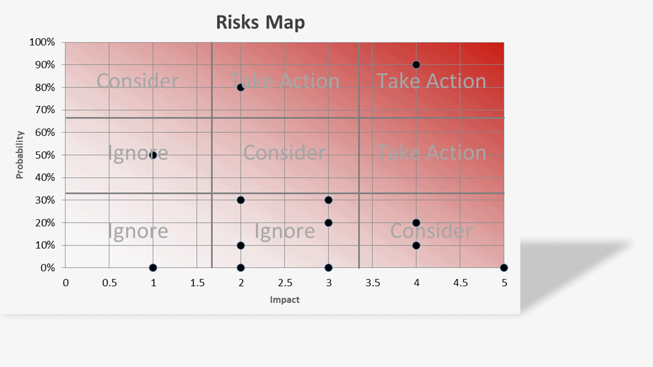
Preventive actions require an investment of company resources and time. For risks in the ignored area, the return on investment in reducing their level is usually negative. That means that the cost of reducing these risks is usually greater than the price to be paid to do so.
Roadmap tab

Here we can cover the entire project work at a glance. Here you can see the destination point we are aiming for on our journey (main objectives), the main towns we will be passing through (sub-goals), the main roads we will be travelling on (project phases) and the means of transport (task packages). This is where project planning practically begins.
Suppose we have to design a new seat for a passenger car so that it is cheaper to manufacture. The project must be carried out in accordance with the company's project management methodology - for an IATF audit.
Several main objectives can, therefore, be defined more precisely:
A- Create a new seat for a car
B- Make the production process more cost-effective
C- Meet project management process requirements.
The first objective can be divided into sub-objectives:
AA- Design sheet metal construction
AB- Design upholstery
AC- Design electronics
The second objective is so clear that it does not require division. The third goal can be divided into individual departments, which will have to perform routine activities in the project, as provided in the project management methodology.
The middle of the roadmap is filled with task packages.
After listing the main and sub-goals, the project manager, together with his team, lists all the task packages that must be completed to achieve the project goals. Here comes a significant advantage of the roadmap: there is no room for task packages that are not necessary for the project goals, i.e. they do not create value from the project point of view! A few kilos lighter at once.
A number in square brackets precedes each task package. Don't worry about that now. I'll explain it in a moment. The most important thing at this stage is to list as many work packages as possible that come to mind. If we have not recorded some work packages now, do not worry about that either. It is impossible to plan all the tasks that will be done in the project, so do not waste your energy and time on this now.
The work packages in the table have three different colours: black, green and red.
- Red automatically marks all work packages which do not have a number in square brackets before their name.
- Green marks all work packages that have already been completed
- Black marks all other packages
In the upper left corner of the table, there is a button "check status". A macro is started by clicking on this button, which checks which packages have been completed and marks them in green. Test: select all the packages (cells C6 to V40) and change the text colour to black (in Excel: Home --> Font group --> Font colour --> black). Now press the "check status" button.
The number of columns and rows can be freely added. Cells in the goals and sub-goals area you have to join together so that task packages for individual sub-goals and goals are in the same column (as in the file you downloaded).
Sizing Tab

In theory, this is where all the work begins. This is when, instead of a computer, we use sticky notes to plan a project. Sizing is a compass for the correct assessment of the effort of tasks and avoiding the inflation of effort of tasks.
The tab consists of two tables:
- main steps,
- steps.
Each of the tables consists of several columns bearing the names of T-shirt sizes. In the first step, all the sub-goals and goals (when there are no sub-goals) must be assigned to one of the sizes between XS and XXL in the "main steps" table.
This task is to make a preliminary division of the project goals according to their effort - not the realisation's length. During the division, it is not important how much objective A's achievement differs in terms of effort from objective B. All that matters here is to determine that objective A's achievement is more, less or equally effort-intensive as the achievement of objective B. Doing this task can start by selecting a sub-goal that is moderately large and assigning it to size M or L. Another way is to select a sub-goal that is the least effort and assign it to size XS. We evaluate the remaining sub-goals by comparing them with the first sub-goal assigned to the table's correct size.
The next step is to copy the work packages for the individual sub-goals from the "roadmap" tab and paste them under the same sub-goals in the "sizing" tab in the "main goals" table. After doing this, you may find, for example, that sub-goal C is not size "L" but "XL". If this is the case, move the sub-goal and its work packages to the column with the correct size. If you run out of rows in the "main steps" table, put them somewhere between row no. 7 and 22.
To easier distinguish sub-goals and goals from task packages, sub-goals and goals are marked in blue. Job packages are marked in green. When a work package is found in only one of the tables, it is coloured white (e.g. cells E10 and D50).
Now proceed analogously with the work packages. We choose the smallest package and copy it into the table "steps" into the column marked "XS". Alternatively, you can select a package with a medium effort and copy it into the column labelled "L" or "M". Then we copy the other task packages into the corresponding columns of the "steps" table - evaluating their effort concerning the first package assigned to the "steps" table.
We can now convert the t-shirt sizes into story points as follows:
- XS=1
- S=2
- M=3
- L=5
- XL=8
- XXL=13 or 21
Why these numbers? These numbers form the Finnocacci sequence.
This is a common and naturally occurring progression that describes how things grow. The growth of rabbit populations, seashells, and tree branches all follows the Fibonacci sequence- as do problem sizes and the efforts required to solve them. [...] It makes the estimating process much faster and more efficient [1].
Several things are essential in scoring:
- The points reflect the effort, not the length of the work package
- The effort needed to complete the work package should take into account: work volume, risk, uncertainty, complexity
- The scoring is done by a team
You can find additional materials about story points/velocity points at the following link:
https://www.mountaingoatsoftware.com/blog/the-main-benefit-of-story-points
https://www.mountaingoatsoftware.com/blog/story-points-are-still-about-effort
Before proceeding, review all the work packages in each column of the steps table and ensure that the tasks in one column do not differ significantly in terms of effort. If a work package requires considerably less or more effort to complete, move it to the appropriate column.
Now we can return to the roadmap tab, and before each work package, enter the appropriate number from the Fibonacci sequence in square brackets.
The data for the tab is entered only once, at the beginning of the project. Work packages added to the project during its duration can also be added to the "main steps" and "steps" tables, but this is not necessary.
What is all this for? The primary purpose is to group and evaluate the effort of the work packages. People are poor at accurately judging the difference between two things: how much Jay is taller than Marry. Instead, it is easier to say that Jay is taller or not.
It is better to be roughly right than precisely wrong. [John Maynard Keynes].
Another reason why the sizing of task packages is essential is the phenomenon of "inflation" of task effort. Imagine that you are working on task X, which should be completed in a week. It took you two weeks. It will be convenient to explain the delay because the initial assessment of effort was inaccurate, and the package should have been rated eight instead of three. To avoid the effort distortion, it is enough to compare this task with other tasks classified under sizes three and eight to quickly detect an attempt to make a poor excuse for delaying the work's completion on time.
Why is the assessment in points and not in days or weeks? If we are assessing effort in a group, work package A may be completed in a week for Jay and in a day for Marry because she is, for example, more experienced. When the assessment is made in points, it is easier to agree that work package A will take three points and work package B as much as five points, although the actual duration will be different for both people (but we will discuss this later).
Do you find it laborious to fill in the "sizing" and "roadmap" tabs with data? Compare the workload of this method to planning a project by the waterfall method using, for example, MS Project. If you have ever planned an entire project in MS Project, then you know that the effort required to fill in an MS Project file is much greater than filling in a few cells in Excel. A shorter way to plan a project that I know is to plan in your head. I don't recommend this to anyone, though 😉
Let's go back for a moment to the theory of the sizing tab mentioned at the beginning of the description. Pre-planning a project in an agile way is greatly facilitated by a large whiteboard/wall, sticky notes of two colours and markers. Using these instruments, you can quickly build something similar to this:
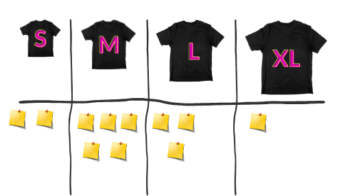
The post-its can be re-pasted between columns, combined with each other and organised in new ways. It is also essential that the whole team can be involved in the planning process and not just the project manager. When the board/wall is not available to the team at all times, you can take a picture of the final version and then transcribe it directly into the roadmap. This saves a lot of time while achieving better results at the same time.
Backlog Tab

This is the heart of all agile project progress management. Here we record the progress of the work. Here we assign task package owners. Here, finally, we specify what is to be done and when.
To get started, delete all data from cell B7 to BB200. However, DO NOT DELETE THE DATA IN COLUMN "J". In the next version of the file, you will be able to do this. Not now.
In cell M6, enter the date you started the project.
At the top of the table, on the second row, you have two buttons, "Roadmap to Backlog" and "Backlog to Roadmap".
Press the "Roadmap to Backlog" button. This will download the data from the "Roadmap" tab. In this way, we have created a list of all currently identified work packages.
In cell D2 the default iteration length in weeks is entered. I suggest leaving it for four weeks. When your project is less than three months, you can reduce this value. When the project is longer than two years, you can consider increasing the iteration length.
Then convene the project team and choose which work packages will be completed in the first four weeks (iteration length). To make the task easier, filter the work packages in column "I" so that those that belong to phase one remain. Now, in column "K", enter the number 1 for those packages that the team believes will be completed in the first iteration. Sum up how many points will be scored in iteration no. 1 (column D) and enter this number in cell D3. This is your estimated rate of work.
Now in the last filled cell of row no. 5, you can see how many iterations it will take you to complete the first phase of the project, and in the row below, you can see the expected completion date. Then assign the remaining work packages from the first project phase to the subsequent iterations.
In the next step, we will focus on the first iteration. Assign each work package in iteration no. 1 to a responsible person from your team. Then break down each work package into more detailed tasks, writing them in column "G". Verify that the work package's effort intensity has been correctly estimated. If not, you can compare it with work packages that have the correct effort intensity, and if indeed this work package should have a different score, enter it in column "H".
During the daily/weekly team meetings, update the status of the completion of each work package in column "N". When the status is set to "Done", points will be assigned for completing that work package. When work has not been completed in an iteration, change the iteration number in column "K" for that work package to the next iteration.
Some cells in column "K" can be pink. This means that these task packages have not yet been allocated to any iteration. In column "C", some task bundles may be red. This means that these bundles have no points given. To assign points to these tasks, select the task without assigned points and press the "Assign points" button.
When you want to add a new package of tasks to the list, you can do this in two ways:
- By adding them at the end of the list in the backlog tab
- By adding them at the appropriate place in the roadmap tab
After adding the package to the list, press the "Backlog to Roadmap" button if you choose the first method. This will bring up two windows in succession. In the first window, you have to select the goal and the sub-goal that this package is supposed to support. In the second window, select the project phase to which the task package belongs. This will add the package to the "Roadmap" tab.
If you choose the second way, after adding the work package in the "Roadmap" tab, return to the "Backlog" tab and press the "Roadmap to Backlog" button. This will update the new list of work packages.
I prefer the second way because then I have the project goals in front of me, and I can quickly tell if the work will add value to any of the project goals.
What if a task takes a while to complete for a team member, but you have to wait a long time for its completion due to the specifics of the task, e.g. ordering an injection mould (submitting a request will probably score 1 point but it will take 3 months to complete it), testing an engine (preparing and launching a test will take 3 points but the test will take half a year)? This may distort the estimation of the completion of a phase or the whole project. The solution is to add up the expected waiting times due to the task's specifics and then add them to the timed completion date of the phase or project.
From the point of view of value creation, it is not important to which package or which iteration lag time (time that has to be passed before the next work package can be started) should be added. The value will be delivered with a release what is, in our case, phase no. (assuming that it reflects the achievement of one key milestone).
Refrain from detailed planning of the entire project. Practice and theory are ruthless in this respect; it is impossible to predict all the design work at the start of a project. Trying to plan them is, therefore, a waste of time and resources.
So how do you predict the completion date of a project?
When you have a fixed completion date: plan (preferably backwards) the completion of the main work of a priority objective. When there are enough time and resources left, add the next main work packages of the next priority objectives. Leave a time buffer of 30% when the planned work scope is clear and agreed with the client. On the contrary, should the buffer in the initial planning phase be larger?
This buffer will be gradually reduced as the project progresses, and additional work packages can be delivered. Honest and open communication supported by expert knowledge of the anticipated progress is essential. Hurrah optimism and unconditional promises to fulfil all wishes by the deadline is not the domain of professionalism.
Consider whether you would prefer to be 95% sure that the MVP (minimum viable product) will be delivered within the time you set and 40% to achieve the other goals? Would you rather be assured (cheated) that the project will be completed on time and then receive its products three months later?
For many sponsors and clients, a time buffer of more than 5% in project planning is inconceivable. As a result, 60% to 90% of projects end up late.
https://www.researchgate.net/figure/Percentage-of-projects-with-time-overrun_fig2_258764637
When you don't have a fixed deadline for completing a project, plan only to complete the first phase and estimate the completion of subsequent phases proportionally based on the expected amount of work and the deadline for completing the first phase.
Below is a chart that illustrates the approximate accuracy of planning depending on the progress of the project:

The cone of uncertainty narrows as the project progresses [2]
Risk Tab

In this part of the spreadsheet, we register all project risks (understood as threats). The following parameters describe each risk:
- Date: enter the date the risk was added to the table. The date of addition to the table should be as close as possible to the risk identification date.
- Risk name: briefly describe the risk
- Phase: in which phase of the project the risk is expected
- Impact: is a numerical rating from 1 to 5. A number 1 means that the risk when it occurs will have a marginal impact on the business value achieved in the project. Number 5 means that the project will not deliver or deliver marginal business value when the risk occurs.
- Prob. (probability) - a value between 0 and 100%. A probability value of 0 means that the risk will not occur. When adding to the list, Risks must have a probability value greater than zero and less than 100%. 0 means that there is no risk. 100% means that the risk will occur. Thus it is not a risk but a fact. The probability value of risk may change during the project.
- Sev. (severity): it is the product of impact and probability. This field is filled in automatically
- Decision: this is a suggested decision to be taken by the team based on the severity assessment. This field is filled in automatically.
- Strategy: there are five possible responses to the risk:
○ Avoid- is when the project team acts to eliminate the threat or protect the project from its impact
○ Transfer- involves shifting ownership of a threat to a third party to manage the risk and to bear the impact if the threat occurs.
○ Mitigate- action is taken to reduce the probability of occurrence and/or the impact of a threat.
○ Accept- risk acceptance acknowledges the existence of a threat, but no proactive action is taken.
○ Escalate- escalation is appropriate when the project team or the project sponsor agrees that a threat is outside the scope of the project or that the proposed response would exceed the project manager's authority [3]
For more, see PMI, PMBOK GUIDE, p. 443 - Action: Here, we can specify the actions performed to implement the strategy (column "K").
Once a month, we assess the probability of the identified risks and enter them in the appropriate column (M, O, Q, ...). During the monthly review of risks, we can also add new risks.
The last cell we should look at is cell "C4" - actual phase. By entering in cell C4 the project phase number, we can see the risk graph of this phase in the "Dashboard" tab. Number 0 means subgroup of risks of all phases. What is it for? As I mentioned above, the total risk severity index should decrease during the project. Sometimes, when we do not have a clear knowledge of what will be implemented in subsequent phases, we cannot immediately identify all the project risks.
Consequently, further risks will be added as the scope of work of subsequent project phases becomes clearer. This, in turn, will lead to a continuous increase in the total risk severity index - which is a sign of too superficial risk analysis. This situation should not occur, however, when we analyse the current phase of the project. The total risk severity index should decrease with the progress of project works.
Graphical representation of data from the "Risk" tab can be found in the dashboard tab.
Summary
The described tool is not the only and always right way to manage projects. If you manage highly repetitive and similar projects, it is probably better to use MS Project. Perhaps your company dictates which tool you should use. In other cases, the tool presented above works great.
Sometimes, however, it is so that one thought or idea quickly turns into an outline of a project, the need for which must first be verified without unnecessary formalities, then the tool described above works great. It allows you to specify the work in detail in the next few days/weeks so that it supports the implementation of the task set for the team without losing the view of the broader perspective on the project.
I have used and still use this tool to manage projects of different sizes and types, from those where you know that nothing is known to those where the only unknown is what time on Friday in two years the production start should take place (SOP).
If you would like to try out my project management tool, please let me know your experience if you encountered any problems and if you have any comments regarding current or missing functionalities.
References
One idea a month on portfolio decisions
No schedule padding, no roundups. A single method, failure pattern or decision framework, explained properly.